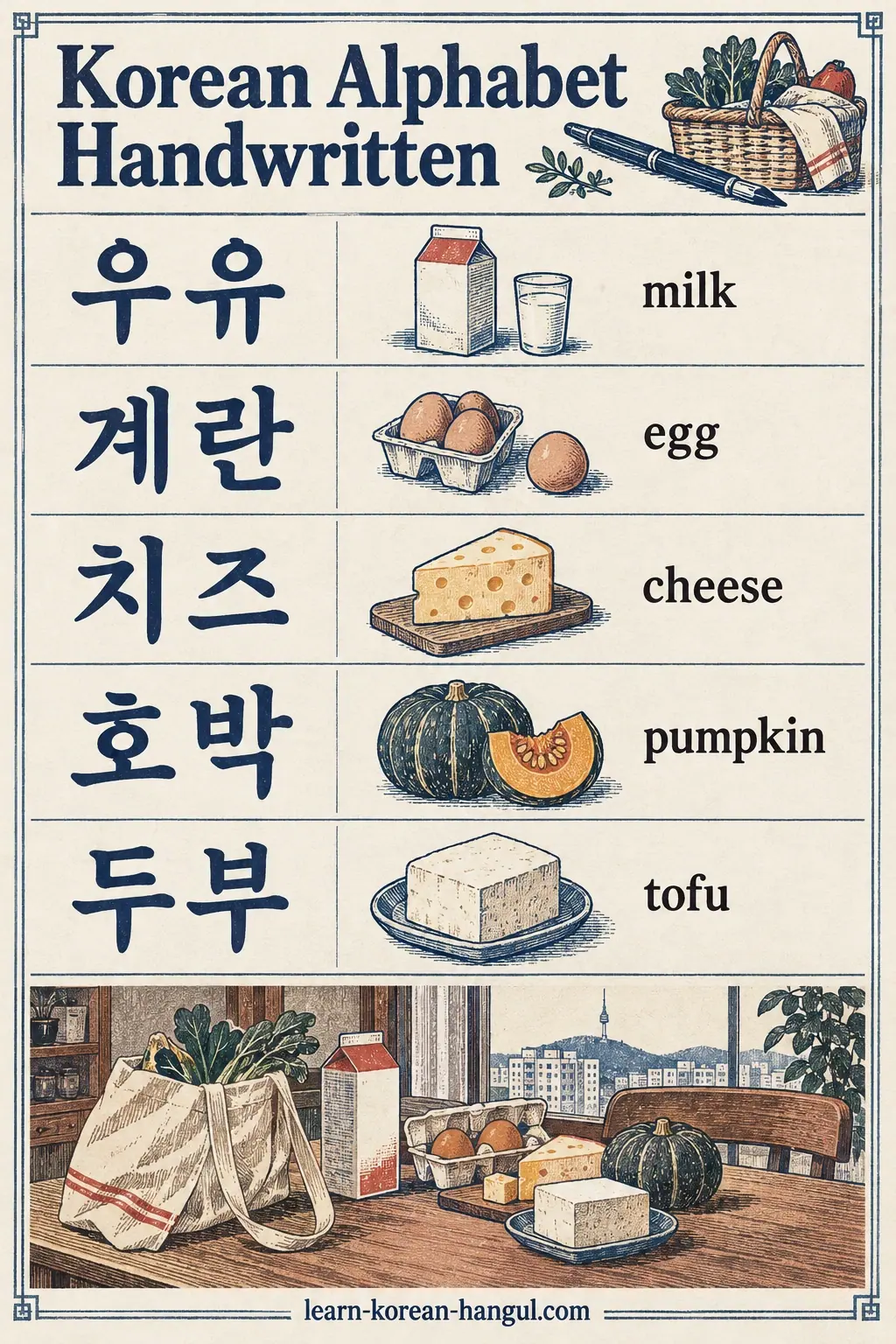
What you'll learn
- Identify the handwritten variants of ㅈ, ㅊ, ㅎ, ㄹ, ㅇ and ㅂ.
- Explain why handwriting and print differ, using three separate causes.
- Write each of the six letters in one legible handwritten form.
- Tell variants that are harmless from errors that change a word.
- Prerequisites: you know the 14 basic consonants and the vowels ㅏ and ㅓ. Estimated time: 25 minutes.
What Does the Korean Alphabet Handwritten Look Like?
The Korean alphabet handwritten looks like a simplified version of the printed letters: the same 24 basic shapes, drawn faster, with fewer pen lifts and softer corners. Most letters, such as ㄱ, ㄴ, ㅁ and ㅅ, look nearly the same in both. Six letters show the most variation: ㅈ, ㅊ, ㅎ, ㄹ, ㅇ and ㅂ.
A variant of this kind is called an allograph: a different way of drawing the same letter that does not change its identity. English has allographs too. The letter "a" can be drawn with a closed loop or as a single-storey form, and every reader accepts both.
Here is a first overview. The table lists what you usually see in print and what you usually see in hand.
| Letter | Name | In many printed fonts | In common handwriting |
|---|---|---|---|
| ㅈ | 지읒 (jieut) | Bar plus ㅅ, three parts | Often two strokes: bar and left leg together, then the right leg |
| ㅊ | 치읓 (chieut) | Short top mark plus the ㅈ shape | Short top mark may be a bar, dash or tick, then the ㅈ form |
| ㅎ | 히읗 (hieut) | Top mark, bar and circle | Short top mark, bar and a loop; the top mark is often a dash |
| ㄹ | 리을 (rieul) | Angular, three horizontal bars | A zigzag, like a squared Z or 2, with rounded corners |
| ㅇ | 이응 (ieung) | Circle; some serif fonts add a mark on top | A plain circle or oval, with no mark on top |
| ㅂ | 비읍 (bieup) | Two verticals and two bars | Verticals may overshoot the bars slightly |
The rest of this lesson takes the letters one at a time. First, you need to understand why the two forms exist.
Why Do Handwriting and Print Differ?
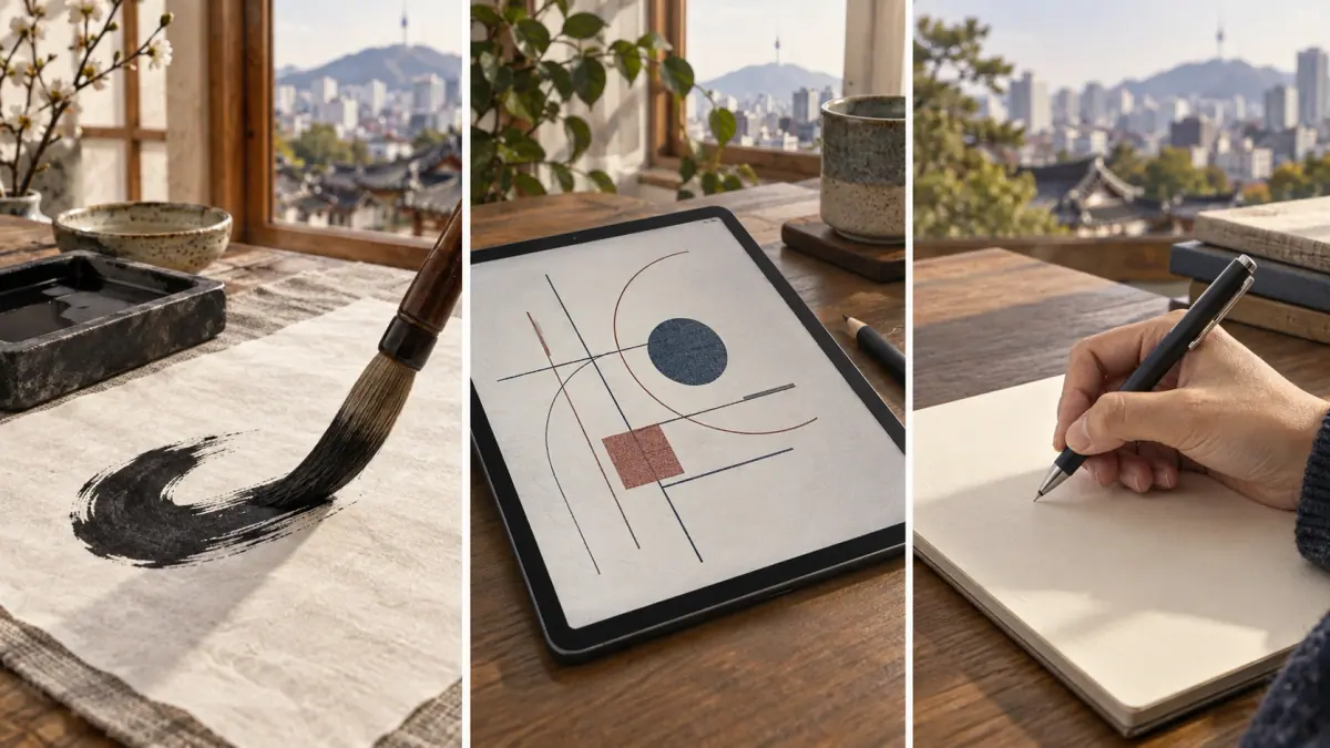
Handwriting and print differ for three separate reasons: printed serif fonts imitate brush strokes, printed sans-serif fonts simplify the shapes into clean geometry, and handwriting follows the speed and direction of the hand. Each pushes the letter shapes in a different direction.
- Serif fonts (명조체, Myeongjo) copy the brush. Their thick and thin parts and small finishing marks come from the tradition of brush calligraphy, as explained in the guide to Hangul calligraphy.
- Sans-serif fonts (고딕체, Gothic) simplify. Lines are even and endings are plain. A shape such as the three-part ㅈ is clean on screen but takes more pen lifts to draw.
- Handwriting follows motion. A hand writing quickly saves lifts. It joins strokes that are next to each other, shortens little marks, and rounds corners.
The second cause explains why a textbook letter sometimes looks wrong to a learner who has copied it exactly. The font is a drawing, not a recipe for movement. You can compare how fonts treat each letter in the guide to Hangul fonts.
An expert insight: handwriting still follows consonant stroke order. The variants combine or shorten strokes, but they keep the same direction: top to bottom and left to right. If you know the standard order, you can predict where a quick hand will merge strokes. Now we can look at the letters themselves.
Letter-by-Letter Variants of Handwritten Hangul
Six letters have regular handwritten variants. This section takes them in the order that most learners meet the problem: ㅈ first, then the pair ㅊ and ㅎ, then ㄹ, ㅇ and ㅂ. The variants are tendencies, so you may see a different form from someone else's hand.
How Is ㅈ Written by Hand?
ㅈ is commonly written in two strokes: the top bar and the left leg together as one bent stroke, then the right leg as a second stroke. The printed form is described as three parts: a horizontal bar, a left diagonal and a right diagonal. Other writers keep the three-stroke order, and both forms are accepted. The sound and the printed shape are explained in the lesson on the letter ㅈ.
Practise on Paper
- top bar turning into the left leg, then the right leg
Why does the two-stroke form exist? Because the bar and the left leg meet at the same corner, a hand can turn from one to the other without lifting. The two-stroke version also gives the letter a more fluid look. The usual error is making the bar too short so that ㅈ looks like ㅅ. Keep the bar longer than the legs' spread.
ㅊ and ㅎ: Line or Dot on Top?
ㅊ and ㅎ both carry a short mark on top, and in handwriting that mark may be a short horizontal bar, a short vertical dash or a slanted tick. All three are correct. What matters is that the mark is clearly separate from the letter below it and clearly shorter than the main bar.
- ㅊ: the top mark, then the ㅈ form below it.
- ㅎ: the top mark, a horizontal bar, then a circle (loop) below.
Practise on Paper
- top mark, bar, then a circle
Writers often choose the dash because it takes the least time. If your top mark is a bar, make sure it does not touch the bar below, or ㅎ can look like a ㅇ with a lid. The sound and the top-stroke variants of ㅎ are in the lesson on the letter ㅎ.
ㄹ, ㅇ and ㅂ
ㄹ, ㅇ and ㅂ vary less than ㅈ, ㅊ and ㅎ, but they still surprise learners.
- ㄹ. In print it is a set of angular bars. By hand it becomes a zigzag, like a squared Z or a 2, written in one or two continuous motions, with rounded corners. The lesson on the letter ㄹ describes the sound.
- ㅇ. In handwriting it is a plain circle or oval, drawn in one stroke. Some serif fonts draw a small mark on top of ㅇ, but this is a font detail and you do not write it.
- ㅂ. The two verticals may extend slightly beyond the bars, so the letter looks like a hash sign with the top and bottom open. A quick hand may also join a bar to the vertical next to it.
Those are the six variants. Seeing them in a real context shows how much simpler reading them becomes.
Worked Example: Reading a Handwritten Note
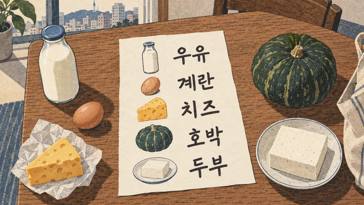
A grocery note is a good test because it uses everyday words and shows the six variants in a natural hand. Suppose the note lists five items. Here is how to read each, letter by letter.
| Item on the note | Word | Key letters to decode | Reading |
|---|---|---|---|
| Two circles, each over a line with legs | 우유 | two ㅇ circles, ㅜ and ㅠ | milk |
| A ㄱ with a two-tick vowel, then a zigzag, a vertical line and a final ㄴ | 계란 | ㄹ zigzag, ㅖ, ㄴ | egg |
| Dash over a bar over a bent leg | 치즈 | ㅊ with dash, ㅈ in two strokes | cheese |
| Dash, bar and loop over a vowel, then ㅂ, ㅏ and ㄱ | 호박 | ㅎ with dash, ㅂ with overshoot | pumpkin |
| ㄷ over ㅜ, then ㅂ over ㅜ | 두부 | ㅂ with overshoot | tofu |
Take 치즈 as the model for your method. First, find the vowels: ㅣ is a vertical line and ㅡ is a horizontal line, so you see a vertical line with letters to the left, and a horizontal line with a bent shape above it. Next, read the initial consonants: a bent shape with a dash on top is ㅊ, and a bent shape with a flat bar is ㅈ. The word makes sense as "cheese" (치즈), which confirms the reading. Always finish by checking that the result is a real word. With the six variants described, the next question is whether any variant can cause a wrong reading.
Do Any Variants Change the Meaning?
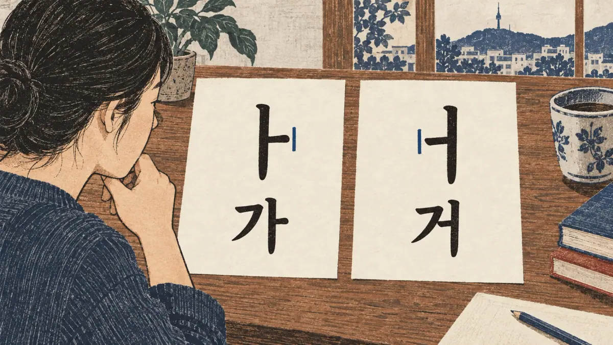
No, none of the shape variants in this lesson change which letter is meant. A two-stroke ㅈ, a dash on top of ㅎ or a zigzag ㄹ is still the same letter. Different mistakes, however, do change the letter, and these are the ones to avoid.
| Careless habit | What it can turn into | Result |
|---|---|---|
| Tick on ㅏ placed on the wrong side | ㅏ becomes ㅓ | 가 becomes 거, a different word |
| Tick omitted or too faint | ㅏ looks like ㅣ | The block becomes unreadable |
| ㅁ rounded into a loop | ㅁ looks like ㅇ | 문 looks like 운 |
| ㅈ with no top bar | ㅈ looks like ㅅ | 자 looks like 사 |
| ㅂ with a missing middle bar | ㅂ loses its shape | 밥 may be misread |
Learners often assume that style is what makes handwriting hard to read. In fact, small ticks and closed shapes matter more than style. A clear ㅏ in a slanted, quick hand is easier to read than a perfect ㅈ next to a vague tick. For that reason, practise ticks first and flourishes never.
Choosing One Handwritten Style
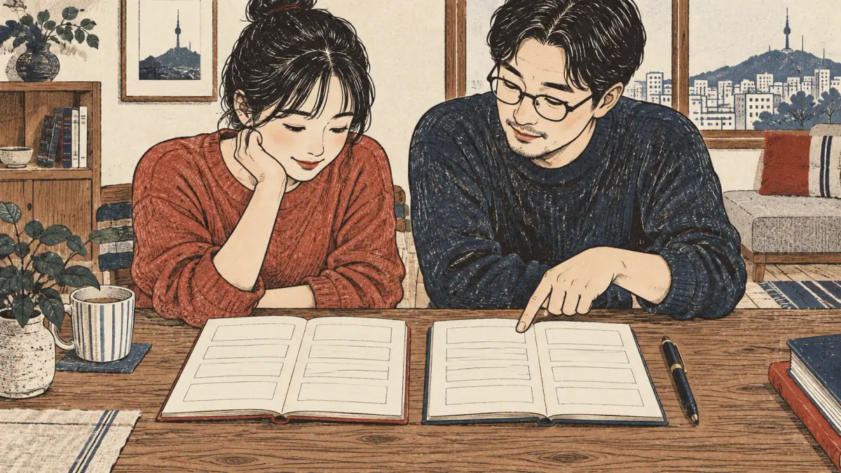
You should choose one handwritten form for each of the six variable letters and use it every time. A consistent hand is easier to read than a perfect hand that changes from word to word, and consistency also builds the muscle memory that makes writing fast.
Follow this short method:
- Start from the standard. Write each letter in the form your class or textbook shows, with the standard stroke order.
- Test the quick form. Write each of the six letters ten times, slightly faster each time. Notice where your hand wants to merge strokes.
- Keep what stays clear. If the faster form is still easy to read, adopt it. If the tick or the circle becomes vague, go back to the slower form.
- Compare after a week. Write the same five words and compare them with your first attempt. Your forms should look more alike, not less.
An honest limit: no list of variants can describe every hand, and some Korean writers use forms not shown here. Your goal is legibility, so when in doubt, choose the form a stranger could read without help.
Practice: Match and Write
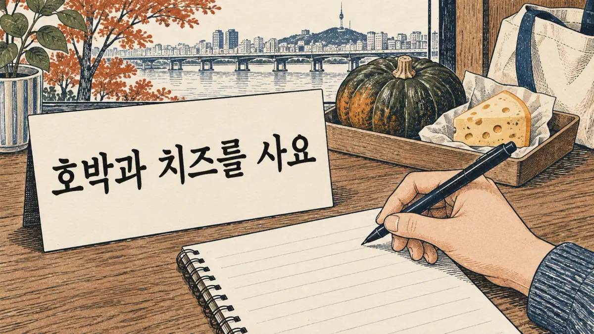
The practice has two parts. In part one you match twelve descriptions to the six letters. In part two you write a short sentence in a single, consistent hand.
Part 1. Match each description to ㅈ, ㅊ, ㅎ, ㄹ, ㅇ or ㅂ.
- A bent stroke, then a second leg; no short mark on top.
- A short dash, a bar, then a loop below.
- A zigzag like a squared 2.
- A plain circle written in one stroke.
- Two verticals joined by two bars, with a slight overshoot.
- A short dash on top of a bent shape.
- A bar plus a left leg, drawn without lifting.
- A small circle under a horizontal bar, with a short mark on top.
- A shape like Z with rounded corners.
- An oval with no mark on top.
- Two vertical lines with a bar in the middle and one at the bottom.
- A short slanted tick on top of the ㅈ form.
Answers. 1 ㅈ, 2 ㅎ, 3 ㄹ, 4 ㅇ, 5 ㅂ, 6 ㅊ, 7 ㅈ, 8 ㅎ, 9 ㄹ, 10 ㅇ, 11 ㅂ, 12 ㅊ. Eleven or twelve correct means you can read the variants. Fewer than nine means you should review the table in the first section.
Part 2. Write the sentence 호박과 치즈를 사요 (I buy pumpkin and cheese) three times on lined paper. Choose one form for ㅈ, ㅊ and ㅎ and keep it the same each time. Check three things: the vowel ticks are on the correct side, every block is about the same size, and you used the same top mark for ㅊ and ㅎ.
When you are ready for more practice, use the printable Hangul worksheets with one style on each page.
What This Lesson Does Not Cover
This lesson covers only the six letters that vary the most in everyday print-style handwriting. It does not cover joined or flowing writing, which is described in the guide to Hangul cursive, and it does not cover brush styles. It also does not cover the sound of each letter, which belongs in the individual letter lessons. Treat the forms here as common tendencies, because every hand has its own habits.
What to Learn Next
The next step is to see how the same letters work with a brush. Move on to Hangul calligraphy, which covers the main brush styles and tools. For the wider picture of how this lesson fits with other writing styles, return to the Korean handwriting hub.
Questions about the Korean Alphabet Handwritten
Which Version of ㅈ Should I Learn?
Learn the two-stroke handwritten ㅈ for everyday writing and recognise the three-part printed ㅈ when you read. Both are accepted. Pick one handwritten form and use it every time, because consistency makes your writing easier to read than any single choice of shape does.
Do Korean Teachers Accept the Printed ㅈ Shape?
Yes. Teachers care that the letter is clear, the stroke order is steady and the block is balanced. A three-stroke ㅈ is a correct form, and so is the two-stroke form. Ask your teacher which one the class follows, and keep to that form on tests and homework.
Why Does My Textbook ㅎ Look Different from My Teacher's?
Textbooks are set in a font, and fonts draw the top mark of ㅎ in different ways: a short bar, a dash or a slanted tick. A teacher writes it by hand, usually faster and with a shorter mark. Both are the same letter, so choose one handwriting form and stay with it.
Is It Okay to Mix Styles?
Mixing is fine while you are learning, but a page reads best in one consistent style. If ㅈ is two strokes in one word and three in the next, a reader loses the rhythm. Choose one form for each of the six variable letters and copy it until it is automatic.